Let's look at the second half of the patterns from Rowan Knitting and Crochet Magazine's Issue 55, since we looked at the first half of its patterns on Monday.
The Wharf design. I rather like this smart, casual sweater. If you don't care to show any midriff or this is too fitted for you, it could be easily made a little longer and looser.
Not a fan of the Boardwalk design, which seems better suited to a little girl or a Muppet than a grown woman. Nothing against little girls or Muppets, you understand.
The Sailor design is another smart casual look. And it's well-styled here. A cute striped skirt like this one combined with this top will make the perfect easy, wearable summer outfit.
Very much like the Celeste design. The stripes are fresh and cute and fun in an adult fashion rather than in a Muppet-appropriate way. NOT MUPPET-IST.
The Buoy design. This is pretty run-of-the-mill design, adequate and wearable without being notable in any way.
Not crazy about the juxtaposition of the stripes and lace in the Port design — they're just not working together as they should. I'd make that waistband plain stockinette in the main colour.
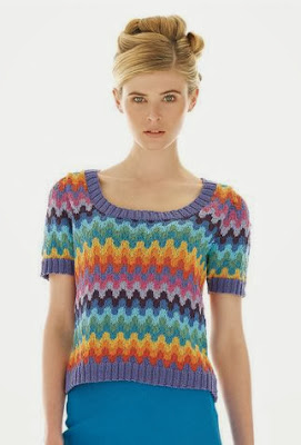
The Surf design is another Muppet-suitable look. I'm being too hard on this one, probably, because maybe a lot of people would think it cute and fun, but those ripple patterns always look too afghan-like to me.
The Cove design. Hmm, a striped t-shirt with a peplum. I'm surprised to find myself typing that I actually kind of like this one. It is a very young woman's style, but I can see it looking cute on a teenager or early twentysomething.
The Sally design is another cute striped number that a grown up can wear. I wish designers would work with vertical stripes more often. They are just as sharp and so much more flattering than horizontal stripes.
The Driftwood pattern. Rowan has really gone to town on stripes in this issue. This one isn't bad, but I would fix the dropped shoulders, make it long enough to cover my stomach, and go with another colourway. This one looks just too Christmassy for a cotton sweater. Unless of course you live in Australia where it's warm at Christmas.
The Pier design. This is another cute little top. Again, if you wouldn't be comfortable in something this short and fitted, it can always be made longer and wider.
The Promenade design. SO MANY STRIPES. The stripes are done in an interesting way and the sweater is well-shaped, at least, so that the overall look is good.
The Gift design. This one isn't bad, though I think it does call out for some tweaking. I'd fix the dropped shoulder and put a bit of ribbing along the bottom of the body. The hem here doesn't look finished.
The Divinity design is a rather nice, simple little top.
The Sierra Wrap. Not a fan of this, which looks a little rough and ready and awkward in shape.
The Chiquitta design. This is afghan-like and very unflattering (admittedly, those two qualities do tend to go hand-in-glove in knitwear). It's never a good sign when the model is shown from a angle rather than full frontal.
The Shore pattern. Another very decent striped pullover.
The Azerbaijan design. I knew this was a Kaffe Fassett as soon as I looked at. As always Fassett's colourwork is distinctive and masterful, but his shaping can be difficult to carry off. If I were making this for an intended wearer who does not have a model-type figure, I'd reshape the item to be standard fit with a cap sleeve.
The Belarus design. The colourwork here is GORGEOUS, but I'd be doing some reshaping of the body of this cardigan, which looks too big and unstructured to flatter most wearers.
The Estonia design. Another Kaffe Fassett design. This one is actually quite well shaped, though you might wish to make it longer and looser than it appears here.
The Latvia design. The only change I'd make to this one would be to make it in some non-pastel colourway, but that's personal preference rather than because there's anything wrong with this palette.
The Lithuania design. This one's sharp and wearable. Though I would not put it with those pants.
The Slovenia design. Love this one as is, although it does appear to be a little long for this (probably tall) model. That's easily remedied, though.
The Moldova design. I see even Kaffe Fassett has climbed aboard the stripe train. Not bad, but I would neaten up the fit and shorten those sleeves a little. That just above the elbow length tends to look dowdy, particularly when it's loose fitting.
The Adella design looks like an afghan with sleeves. It's all bunchy in the back and none too flattering in the front. Afghans really only belong on couches.


No comments:
Post a Comment